How do you track your progress to Financial Independence? Perhaps you’ve already started down the path to FI and are wondering “when will I be financially independent?” This post presents a visual technique for answering those questions.
The technique itself is something I use regularly at my day job to track the status of various projects. Burn-up graphs are a way of visualizing how much work has gone into a project already, how much remains, how quickly the work is being done, and projecting a date for when the project will be finished. All of that in a simple picture!
In this post, we’ll see how the technique is adapted from the project management world to the world of financial independence, show how it tracks your FI picture over time, and experiment with some variations to make it even more meaningful to your FI journey.
Components of an FI Burn-Up Chart
Let’s take a look at the simplest possible FI Burn-Up graph we can draw:
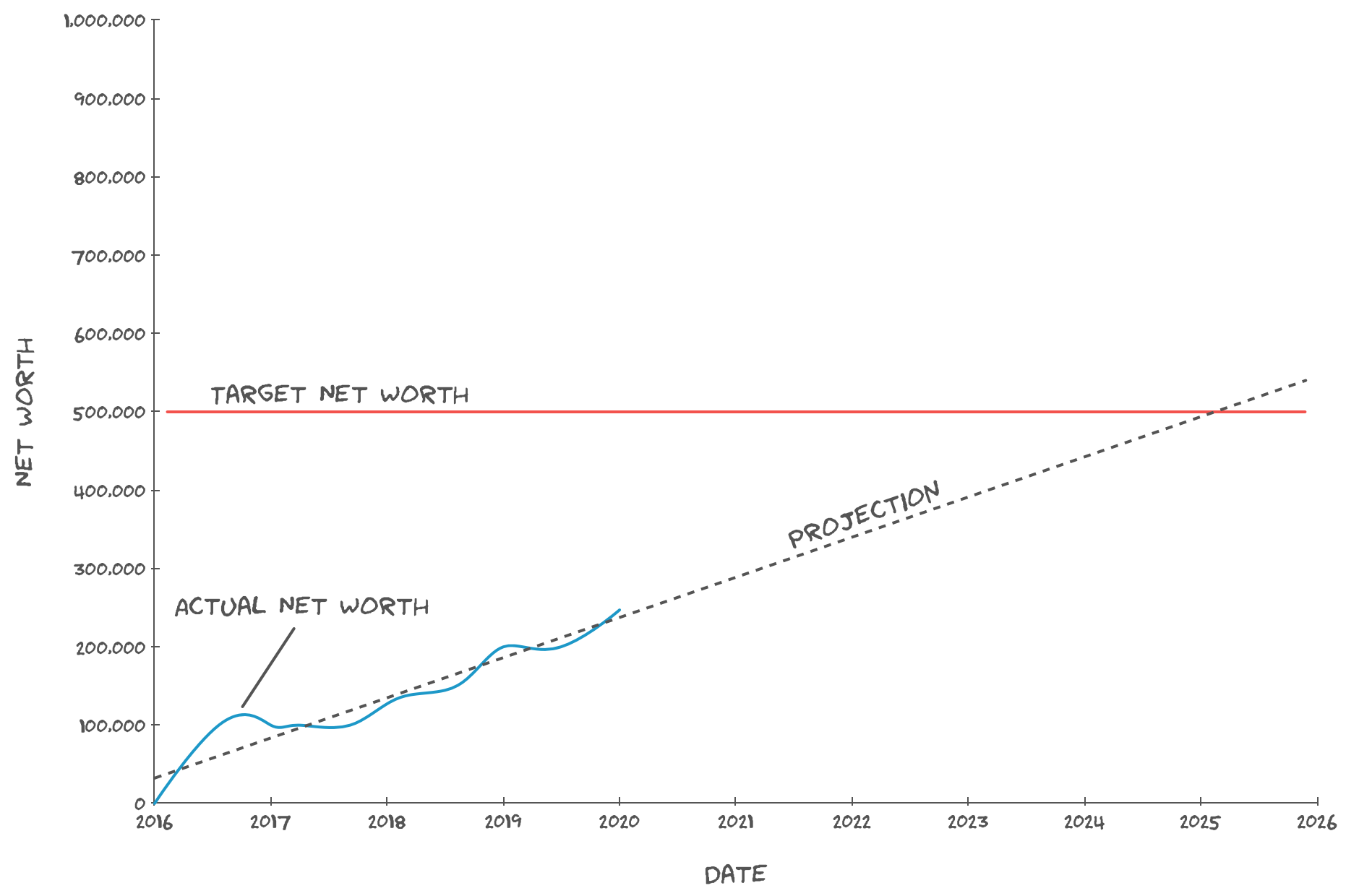
“OMG, graph, lines, numbers! This seems too much like work to have anything to do with FI!” Don’t worry, it’s not as bad as you think. Here are the three main components of your FI Burn-Up:
Actual Net Worth. It’s the blue, squiggly line, beginning in 2016 (the date when this example was started) and ending almost at 2020 (today’s date). This line shows how your net worth has changed over time, and the rightmost point on the line is your current net worth. To make this part of your graph, calculate your net worth on a regular basis and plot it on a graph. In the example above, the net worth started at $0 on January 1st, 2016 and has climbed to $250,000 today.
Target Net Worth. This is the red line along the top of the graph. It represents your FI Number: the net worth you need to be financially independent. Figure out your target using the 4% rule and plot a horizontal red line on your burn-up graph at that value. In the example above, it’s $500,000.
Projection. This is the dashed line that follows the trend of your growing net worth and continues into the future, eventually intersecting the target net worth (red line). It represents the historic average of all of the up and down fluctuations of your net worth, and extrapolates how, if things continue as they have, your net worth will change over time.
As a first approximation, that’s all you need to make an FI Burn-Up graph. At a glance, it provides answers to questions like:
- How has my net worth changed over time?
- What’s my FI number (my target)?
- On average, how quickly is my net worth growing?
Also, it helps you answer another question: “when will I be financially independent?” Look at where the projection of your net worth (dashed line) intersects the target net worth line. The date at which it intersects (February, 2025 in this example) is the projection of when you’ll be financially independent! A quick warning: the projection is based entirely on the historic movements of your net worth, so please remember that “past performance is no guarantee of future results.”
Tracking Your Target Net Worth Over Time
One of the advantages to the FI Burn-Up graph is that the Target Net Worth line doesn’t have to be a horizontal line. It can vary over time, too. You can use this to your advantage to account for the effects of inflation on your future projections, as well as to track your progress in cutting living expenses.
Accounting for Inflation
The 4% rule accounts for inflation once you’ve reached your target net worth and entered the draw-down phase, but what about before that time? Just because your annual expenses are $20,000/year today, it doesn’t mean they’ll stay constant and still be $20,000/year by the time you reach financial independence. To account for this, the target net worth line of the FI Burn-Up graph should have a slight upward bend, starting today and increasing by 2% every year (or whatever the expected rate of inflation is).
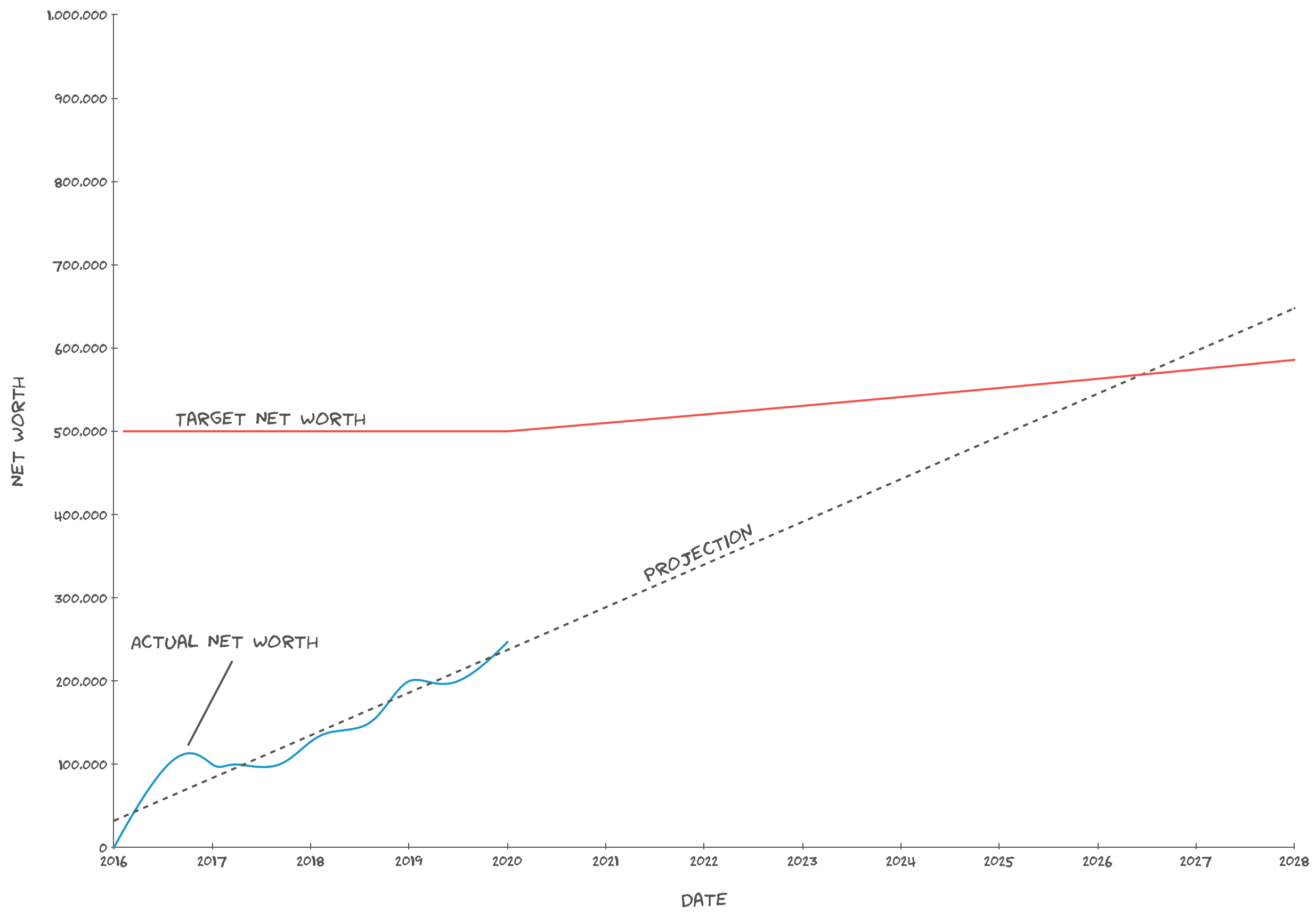
The target net worth line starts at $500,000 today (enough to support a $20,000/year safe withdrawal rate at 4%) and increases by 2% every year. Note that the increase looks like a straight line, but it’s actually an exponential curve and would appear at such if shown on a longer time scale.
Unfortunately, this pushes out the intersection of the two lines from February, 2025 to May, 2026. However, it’s a more realistic projection of when you’ll be FI since it takes inflation into account, and allows you to plan accordingly.
Tracking Costs Over Time
We just talked about how you can account for inflation by increasing the target net worth line in the future, but what about the past? Just like the FI Burn-Up graph tracks your historic net worth, it can also track your historic target net worth.
Why would you want to do this? For one, tracking your historic target net worth shows progress you’ve made at cutting costs from your life. Let’s work through a simple example. Assume that, back in 2016, you lived pretty much as you live today, except for one big difference: you lived far away from your office and commuted there every day in a car. Back then, your annual expenses were $30,000/year, giving a target net worth of $750,000 assuming a 4% safe withdrawal rate.
Part of the way through 2017, you considered moving close enough to the office that you could walk, ditching the car. The all-in cost of the car (monthly payments, insurance, maintenance, gas, etc.) was $15,000/year, so you’d save a lot by getting rid of the car. Of course, you’d have to move closer to work, and that would cost an extra $400/month, which is roughly $5000/year. This is still pretty good–this strategy would reduce your overall annual expenses by $10,000/year, from $30,000 to $20,000. Not to mention you’d get to spend less time commuting, get more exercise, and experience less stress on your way to and from the office. Therefore, in mid-2017, you pulled the trigger and moved closer to the office and ditched the car. As predicted, your expenses went down to $20,000/year, reducing your target net worth from $750,000 to $500,000. Let’s see how that looks on the FI Burn-Up graph:
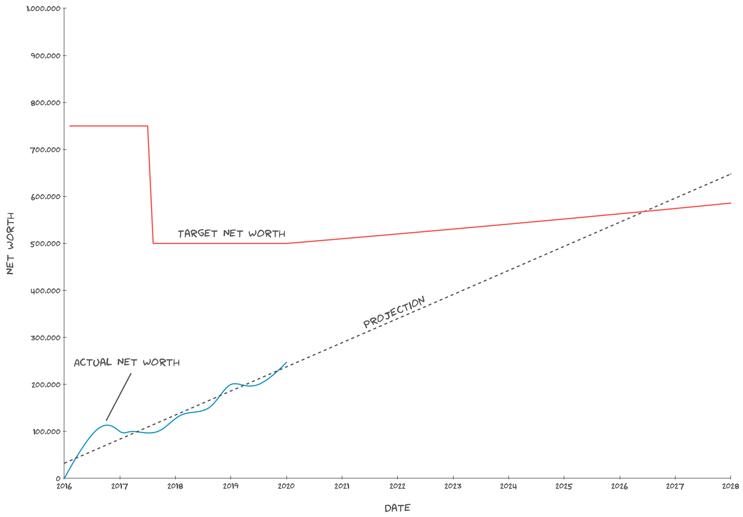
Wow, what a difference–pat yourself on the back! Isn’t it great how the burn-up graph shows, at a glance, lifestyle optimizations you’ve applied and their impact on your overall financial picture?
Another reason to track your historic target net worth is that it also gives you an idea of how fast your target net worth grows over time, which is your personal rate of inflation. Perhaps the areas where you spend your money inflate faster than the average rate of inflation–if you notice this, you might want to increase the rate at which you inflate your target net worth in the future.
Variations on FI Burn-Up Graphs
So far, we’ve seen how the FI Burn-Up graph helps us to quickly visualize where we are, where we’ve been, and where we’re headed on our journey to financial independence. However, financial independence is a bit more complicated than that. First, the 4% rule is really just a rule of thumb and isn’t one-size-fits-all. If anything, your target net worth is more of a range than a single value. Second, there are multiple levels of financial independence that you may want to incorporate into your burn-up graph.
Target Net Worth Range
A lot has been written about safe withdrawal rates and the wisdom of using 4% to compute your target net worth. As much fun as it would be, this post doesn’t intend to re-litigate that question. The upshot of it all is that it may be more appropriate to graph a target range instead of a single value.
As an example, perhaps you think a safe withdrawal rate of 4% is a good starting point, but you’ve heard that it doesn’t always work out, and 3.25% seems like a much safer SWR to you. That’s fine, why not put them both on the graph:
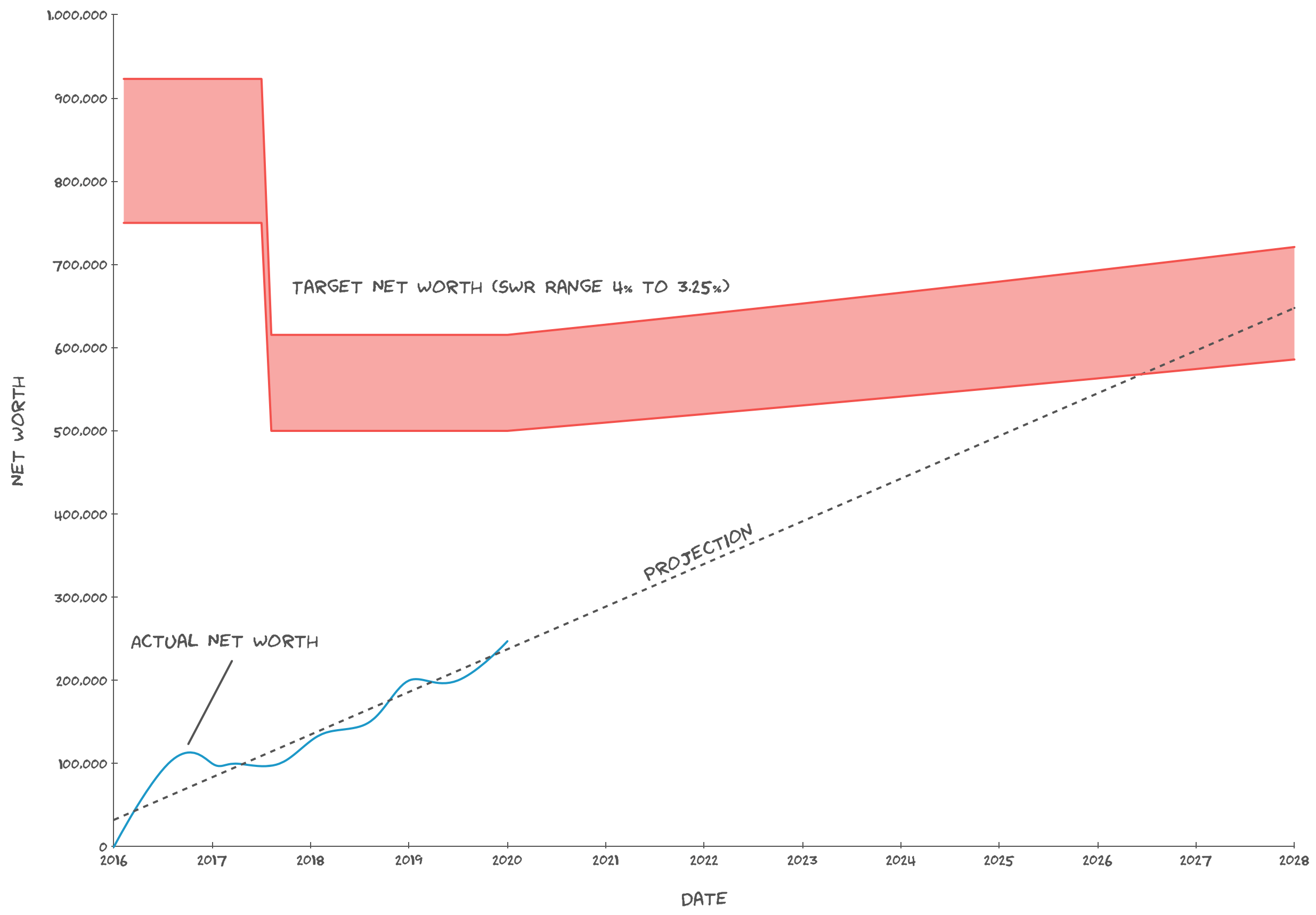
Having a range for your target net worth shows when you might first consider changing your lifestyle, and also shows the journey after that point, if you continue working, to increased confidence that the lifestyle will be sustainable.
Multiple Levels of Financial Independence
As an anxious person, I worry that something might happen to me and I’d lose my ability to earn income in my current, well-paying field. It’s a terrifying thought, so how do I deal with it? On those days, my target net worth seems so far away, so I console myself with the knowledge that there are multiple levels of financial independence. If I really had to, I could stop working completely and still be able to survive. It’s not the retirement I want, but if something horrible happened at least I wouldn’t be destitute.
Therefore, I think it’s helpful to include multiple target ranges on your FI Burn-Up graph. Perhaps you’ll name them “Lean FIRE”, “FIRE”, and “Fat FIRE”. Or maybe you’ll do like I do and have a primary target range as well as a “subsistence” range:
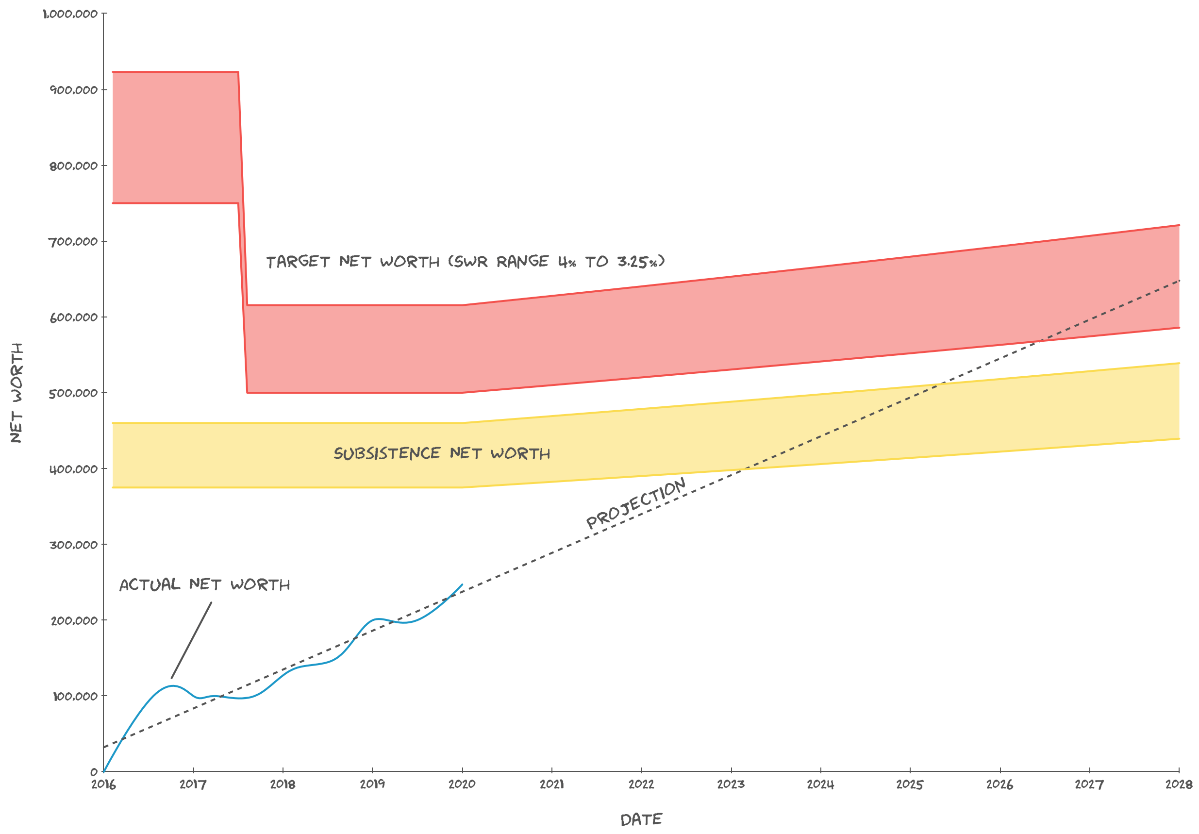
In the above graph, you can see how close the “subsistence” range is. It’s defined as being the minimum amount of money you need to put a roof over your head, feed yourself, etc. in perpetuity (according to a range of safe withdrawal rates). Once you attain subsistence, everything else is bonus to support an improved standard of living. If you’re still worried about not even making it that far, you can take action to cover the gap, for example by purchasing some disability or critical illness insurance.
One thing to note: In the graph above, a car wasn’t needed to “subsist”, since it was only needed to go to work. So the “subsistence” target net worth didn’t change when the car was ditched.
Conclusions
In this post, we’ve looked at how the concept of a burn-up graph can be applied to your journey to financial independence. The FI Burn-Up shows you how your path to FI has evolved over time, when you’re expected to reach FI, and how you can view your progress on multiple levels. I think it’s a great tool and, hopefully, I’ve convinced you to get started plotting your own! If you find the idea useful, or have any questions, feel free to leave a comment below.